Klatchpoint. Landing Page [Summer Program 2023]
Página web do Klatch para organizadores de eventos
Estágio de verão
O site para a aplicação Klatch foi desenvolvido no âmbito do programa de estágio de verão 2023 e integrou cinco estudantes de diferentes áreas: design, desenvolvimento de software e gestão. O desafio foi criar um website com uma página inicial e outras informações que explicam algumas coisas sobre a aplicação. Parece fácil, certo? Sim… Mas nem sempre é fácil pensar em algo que já existe, onde temos de entender o conceito e o que é necessário ser feito.
O que é a Klatch?
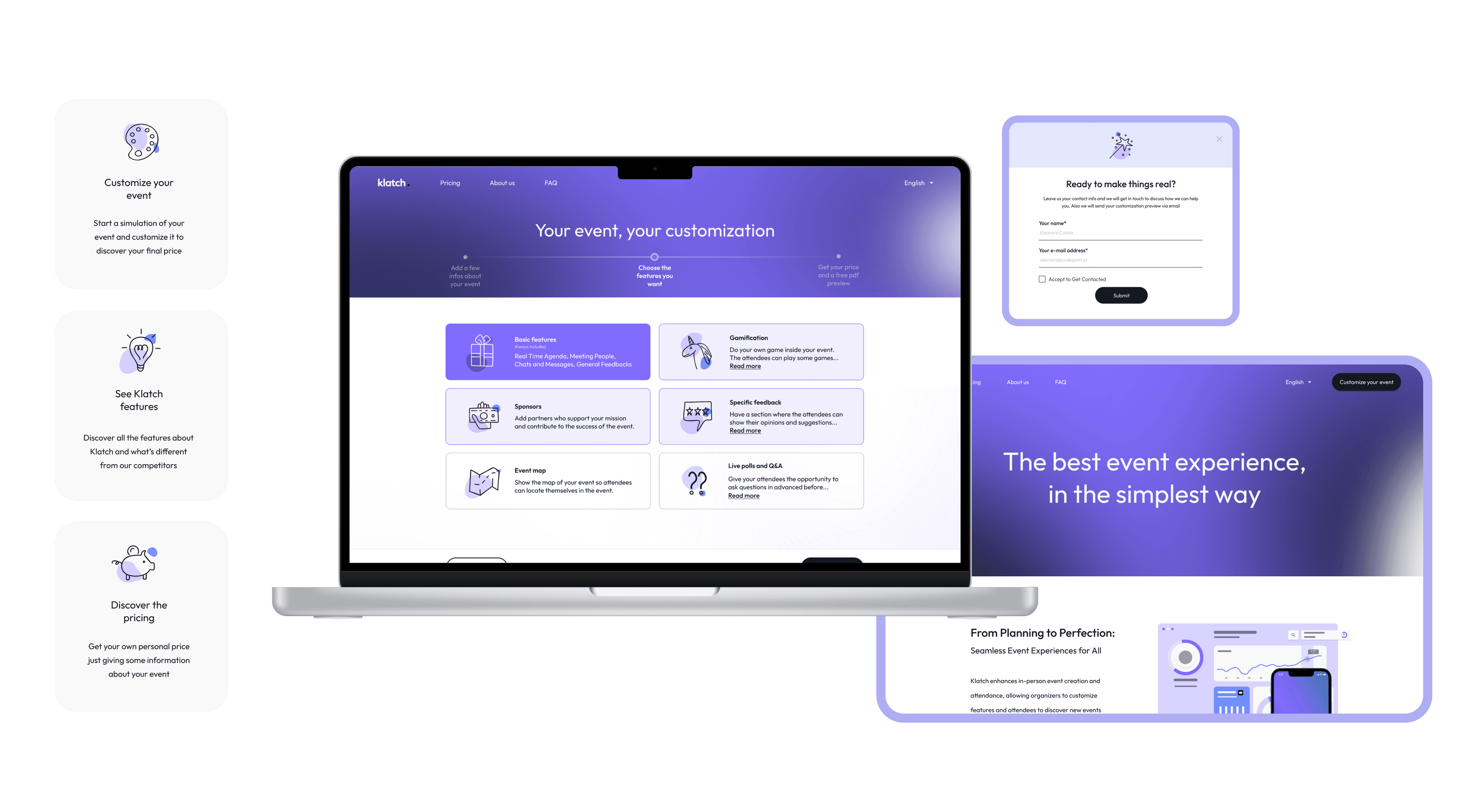
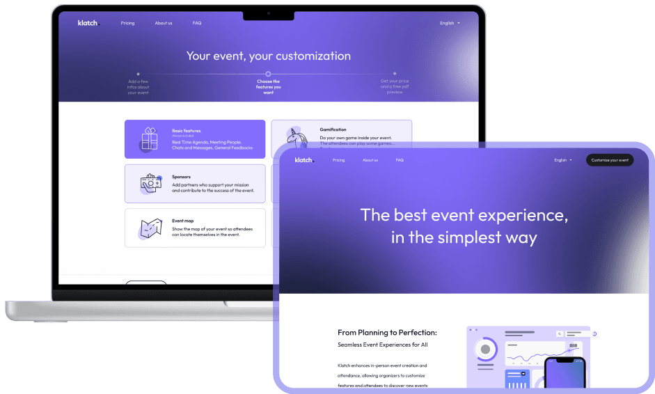
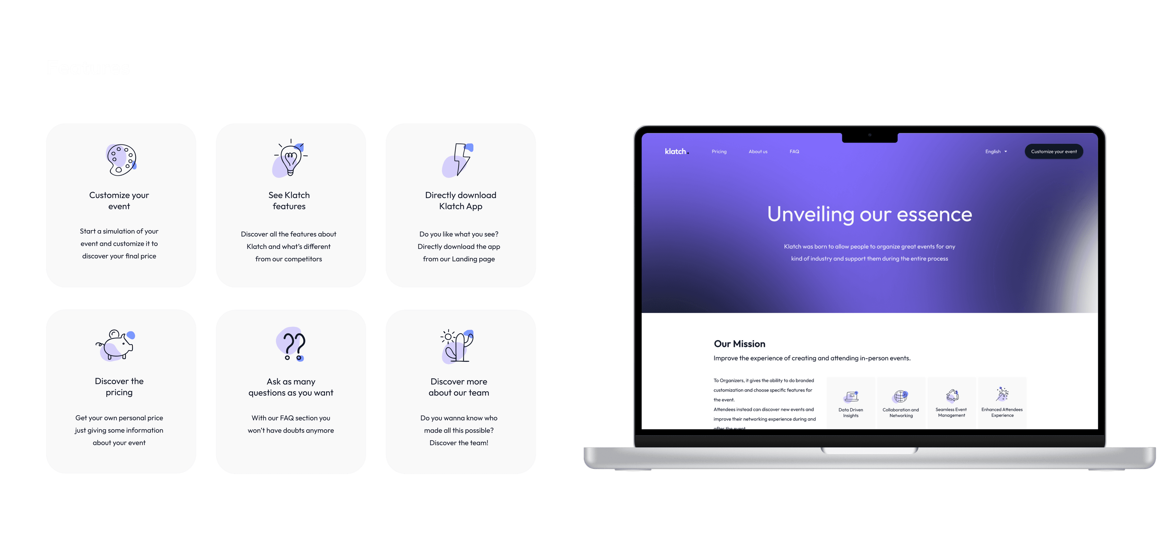
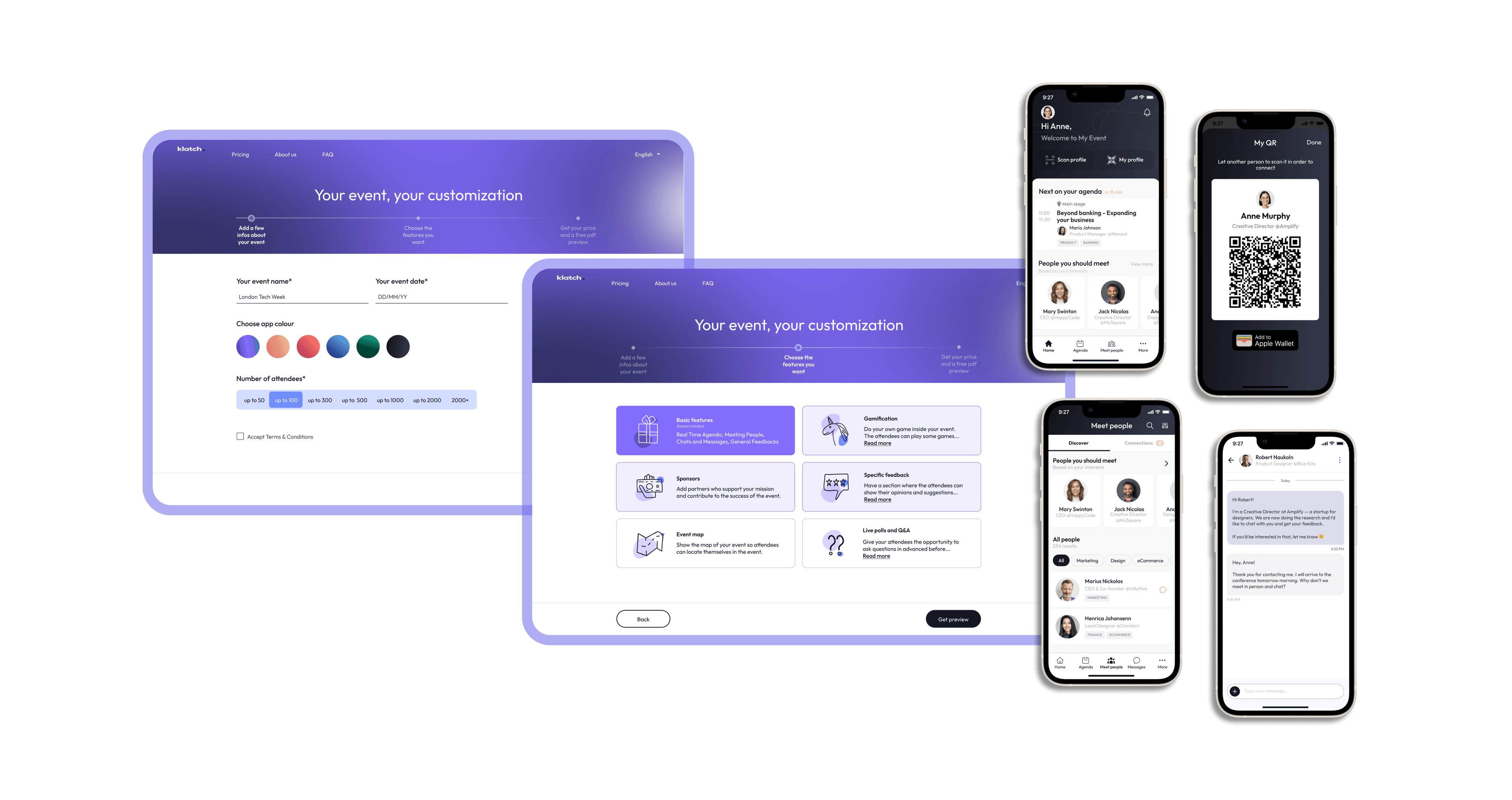
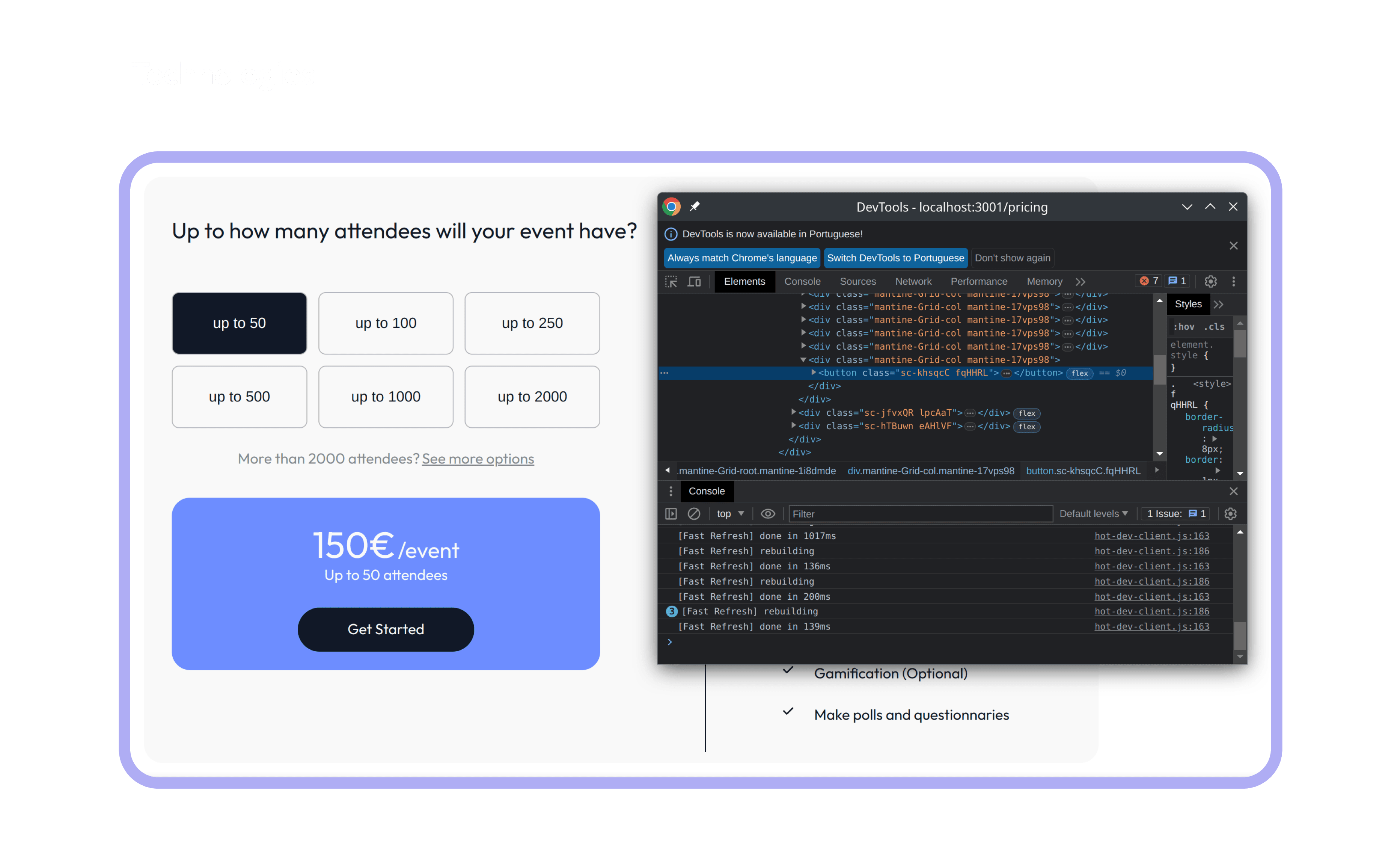
Klatch é um serviço para criar e gerir eventos de uma forma personalizada que pode integrar diferentes tipos de eventos. O serviço tem múltiplas funcionalidades: criar um evento, criar um perfil, gerir a agenda, conhecer pessoas, gamificação e outras mais. O nosso projeto é criar um website para vender a aplicação, no qual explicamos a aplicação e o que o cliente poderá encontrar se a comprar. Queremos que os nossos utilizadores tenham uma experiência completa da aplicação para que sejam incentivados a comprá-la (por isso é que trabalhamos tanto na página do preço e na área da customização).
O nosso projeto é criar a página inicial para vender um serviço. De facto, aqui explicamos tanto as funcionalidades da aplicação como do website e o que o cliente poderá encontrar se comprar o serviço. A página inicial é necessária porque é o primeiro ponto de contacto que os organizadores veem quando entram em contacto com a Klatch e também é a primeira ocasião em que temos de vender o nosso produto!
Antes de começarmos a nossa caminhada, precisamos de entender o que já existia em termos de gestão de eventos e, por isso, começamos uma pesquisa de competidores, para ver ideias e o que podíamos acrescentar para fazer com que a experiência dos utilizadores fosse a melhor experiência possível.
Encontramos muitos competidores com websites parecidos com o que queríamos fazer, por isso juntamos algumas coisas que fomos gostando de cada um e criamos o nosso próprio estilo.
Vimos exemplos muito bons, de onde tiramos alguns detalhes, mas também encontramos maus exemplos que nos mostram aquilo que não queríamos.
Enquanto procuramos exemplos, fomos pensando sobre as funcionalidades que queríamos e inspiramo-nos em alguns competidores para ver o que poderíamos ou não ter.
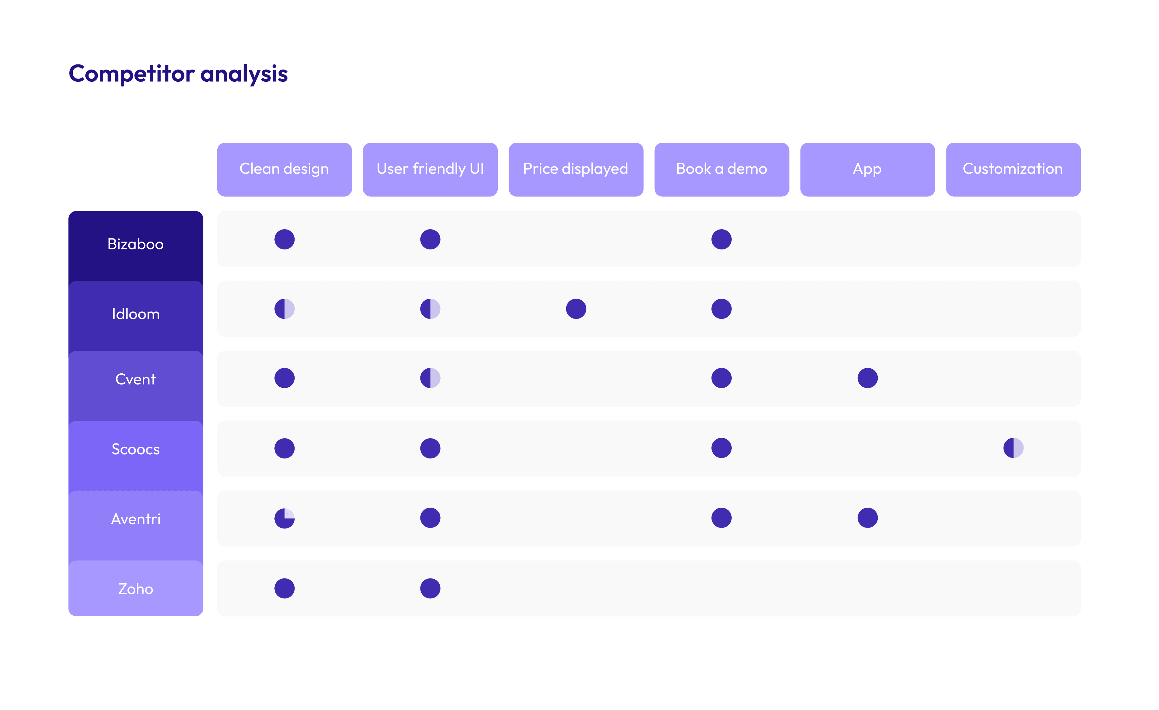
Como pode ver, nós tentamos integrar na nossa página inicial tudo o que encontramos de bom na concorrência. Ainda mais, acrescentamos o que eles não tinham e, no fim, o nosso produto tem todas as características da tabela abaixo.

De acordo com o dicionário, Klatch é o ato de falar e partilhar tópicos de interesse comum com outros, normalmente de modo informal e amigável. Nós pensamos num evento como uma junção de pessoas com interesses comuns em que as pessoas possam ter a oportunidade de se conectar com outras nos eventos em que participam. O nosso logótipo é simples e direto: o nome da aplicação com um design simples, como algo muito próximo de nós. Queremos que no futuro as pessoas vejam o nosso projeto como uma possibilidade de se conectarem com pessoas com os mesmos valores.
Utilizamos algumas tecnologias que nunca tínhamos utilizado, ainda que tenhamos alguns conhecimentos sobre programação na web e estas tecnologias sejam o próximo passo na aprendizagem de desenvolvimento web, e também já tínhamos utilizado bootstrap, que é similar ao Mantine.
A parte mais desafiante foi entender a estrutura do projeto, porque já existia e levou algum tempo para entender qual era o propósito de cada pasta e ficheiro.
No entanto, nós gostamos de desafios, por isso, a parte que mais gostamos foi a parte da customização, porque é a funcionalidade principal do nosso website e deu-nos um sentimento de concretização quando a acabamos e vimos o resultado final.