Klatchpoint. Landing Page [Summer Program 2023]
Klatchpoint. Landing page for event organizers
Summer Internship
The website for the app Klatch was developed within the Summer Internship Program 2023 and integrated five students from different areas: UX/UI design, software development and management. The challenge was to create a website with a landing page and other information that explains some things about an application. Sounds easy, right? Yes… But it is not always easy to think about something that already has a background story, where we have to understand the concept and what it is supposed to do.
What is Klatch?
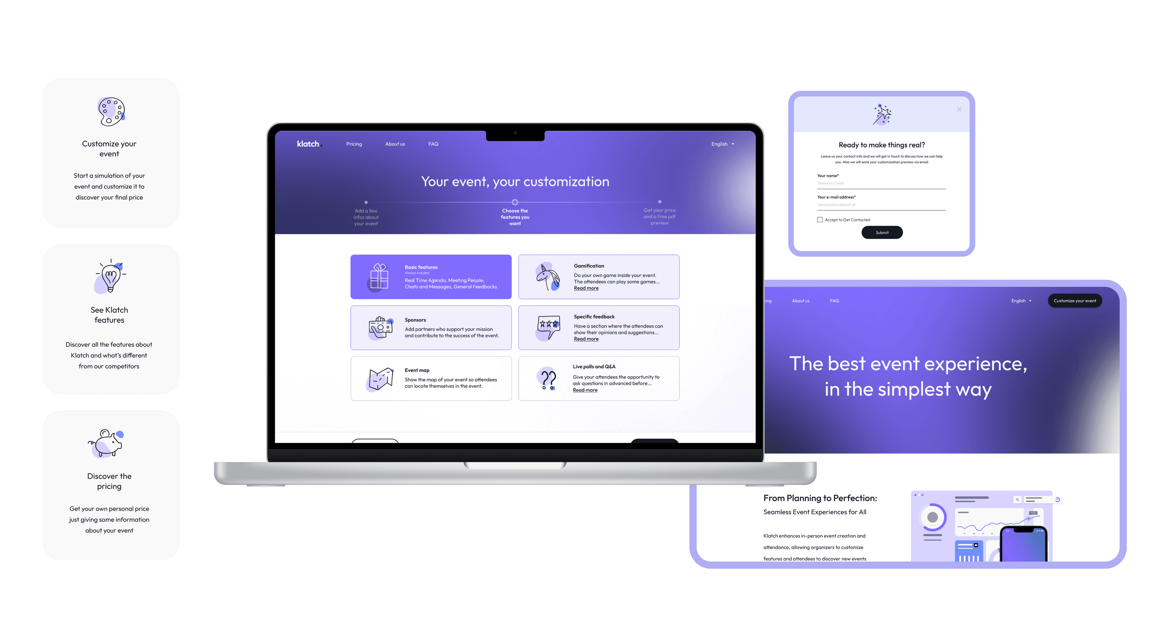
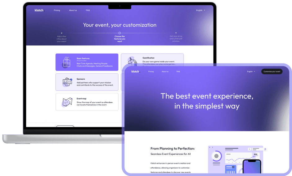
Klatch is a service for creating and managing events in a personalized way to suit different types of events. It has multiple features: create event, create profile, manage agenda, meet people, gamification, and some others. Our project is to create a website to sell the app, in which we explain the app and what the client will find if he buys the app. We want the users to have the full experience of the app in order to get them to buy it (that’s why we work so hard on the pricing page and create the customization area).
Our project is to create a Landing Page to sell the service. In fact, here we explain both the app and the webapp features, and what the client will find if he buys our service. The Landing Page was necessary because it’s the first touchpoint that the event organizers see when they get in contact with Klatch and it’s also the first occasion we have to sell our product!
Before we began our journey, we needed to understand what already exists in terms of events management and so we started doing competitor research, to see ideas and what we can add more to make the user experience the best experience possible.
We saw that a lot of competitors have similar websites to what we were looking for, so we gathered some of the things we liked most from each one, and came up with our own style. We could see some very good examples, where we took some details, but we also could see some bad examples that showed us what we were not going to do.
Meanwhile we were thinking about the features we wanted and so we took some inspiration from competitors to what we can and can not have.
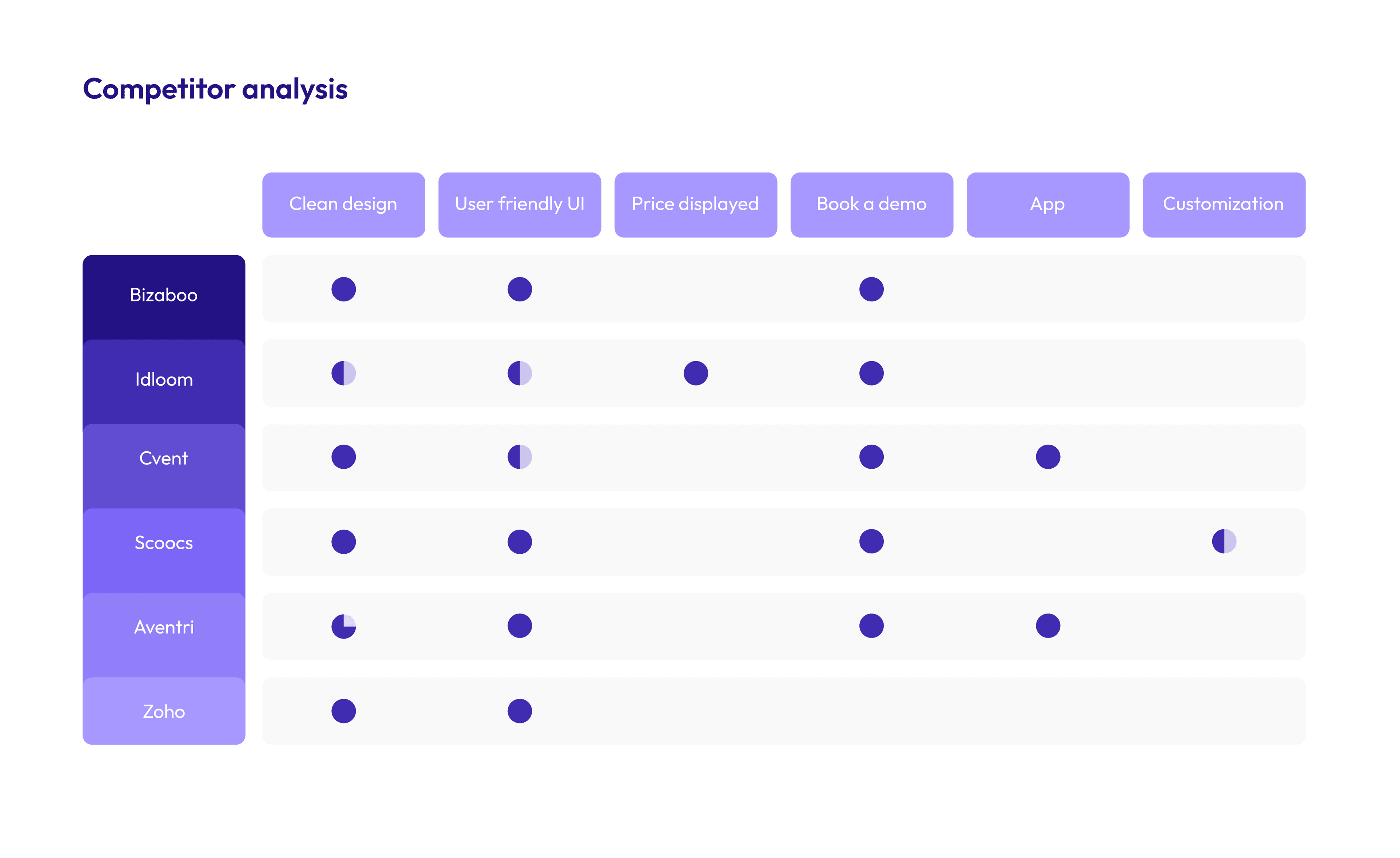
As you can see, we tried to give to our landing page what we think was the best from the competitors. Moreover, we added what they didn’t have and in the end our landing page has all the characteristics displayed in the table.
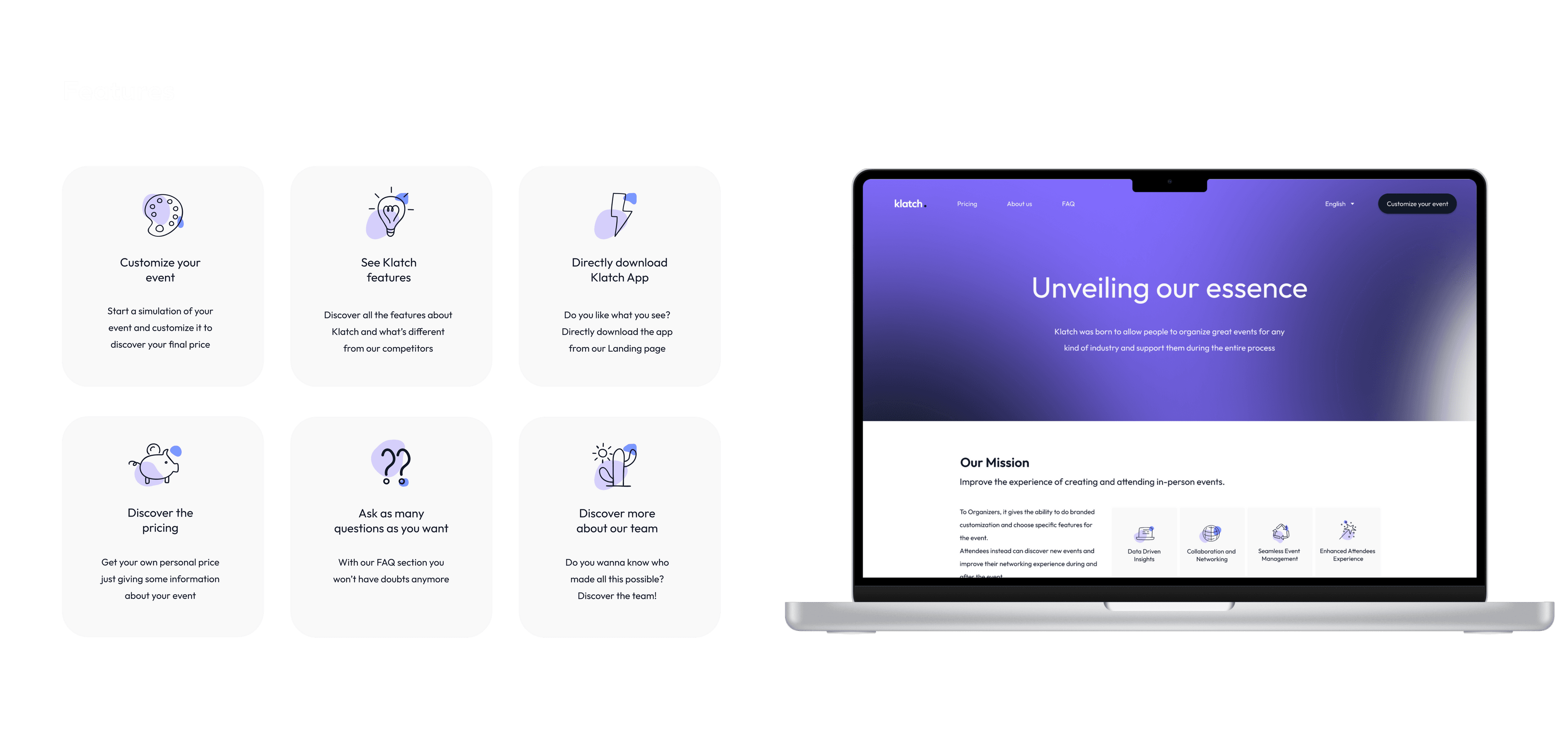
In our landing page we have 6 main features, like downloading the app, discovering our team and seeing the price section.
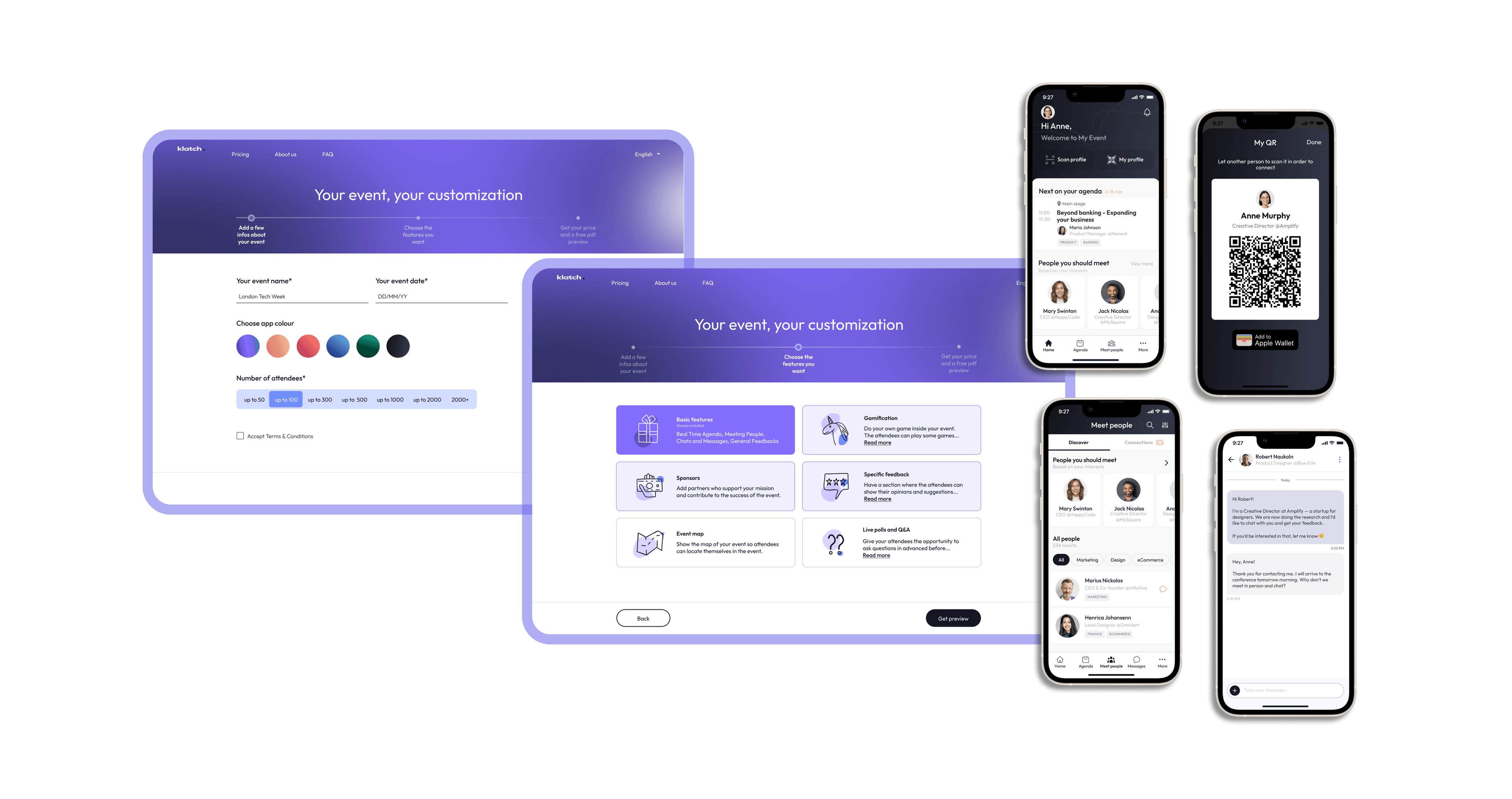
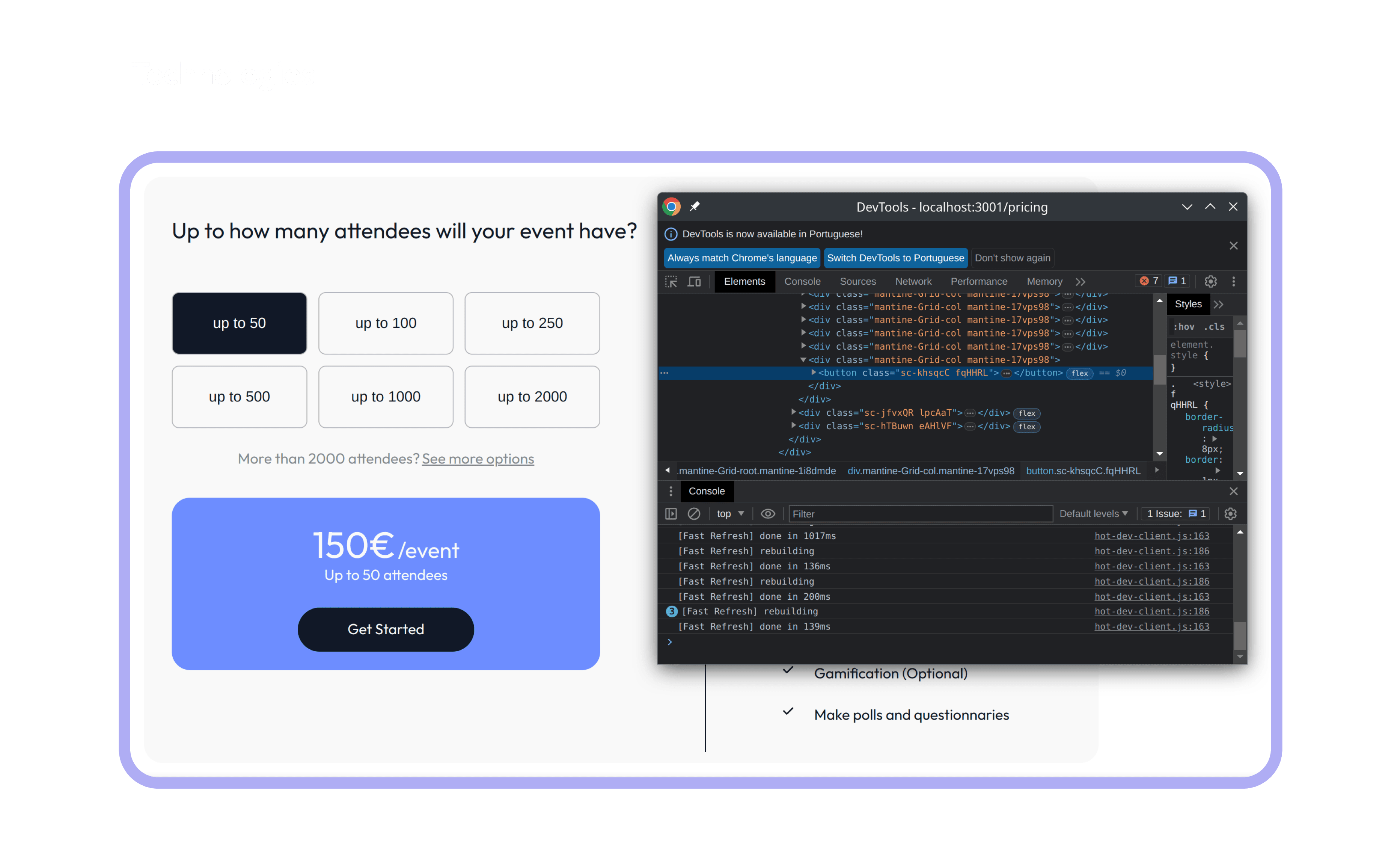
But the one we’re most proud of is the customization feature.Thanks to this, After adding some basic information about the event and choosing the features that they want, all the event organizers can have a preview about how their event app will look like and also have a trustable price range.
According to the dictionary, Klatch is the act of talking and sharing topics of common interest with others, usually in an informal and friendly way. We think of an event as a gathering of people with common interests, and we think that people could have the chance to connect with each other on the events they attend. Our logo is clear and direct: the name of the app with a simple design, like a cozy thing close to us. We aim in the future that people see the project with a possibility to connect with others with the same values.
We used some new technologies we have never used before, although we had some basic knowledge of web programming and these technologies are the next step for a web developer to learn and we have used bootstrap which is quite similar to Mantine.
The most challenging part was getting used to the project structure because it was already provided to us and it took us some time to learn what was the purpose of each folder and file.
But we liked the challenge, so the part we enjoyed the most was the customization part, because it is the main feature of our website and it gave us the feeling of accomplishment when we finished it and saw the final result.