Client
Reformas na Suíça is a company which provides support in organizing the retirement of people who immigrated to Switzerland. The company helps people to locate and monetize all their money, takes care of the entire process of returning to their country of origin and planning their pre-retirement and retirement.
Challenges and objectives
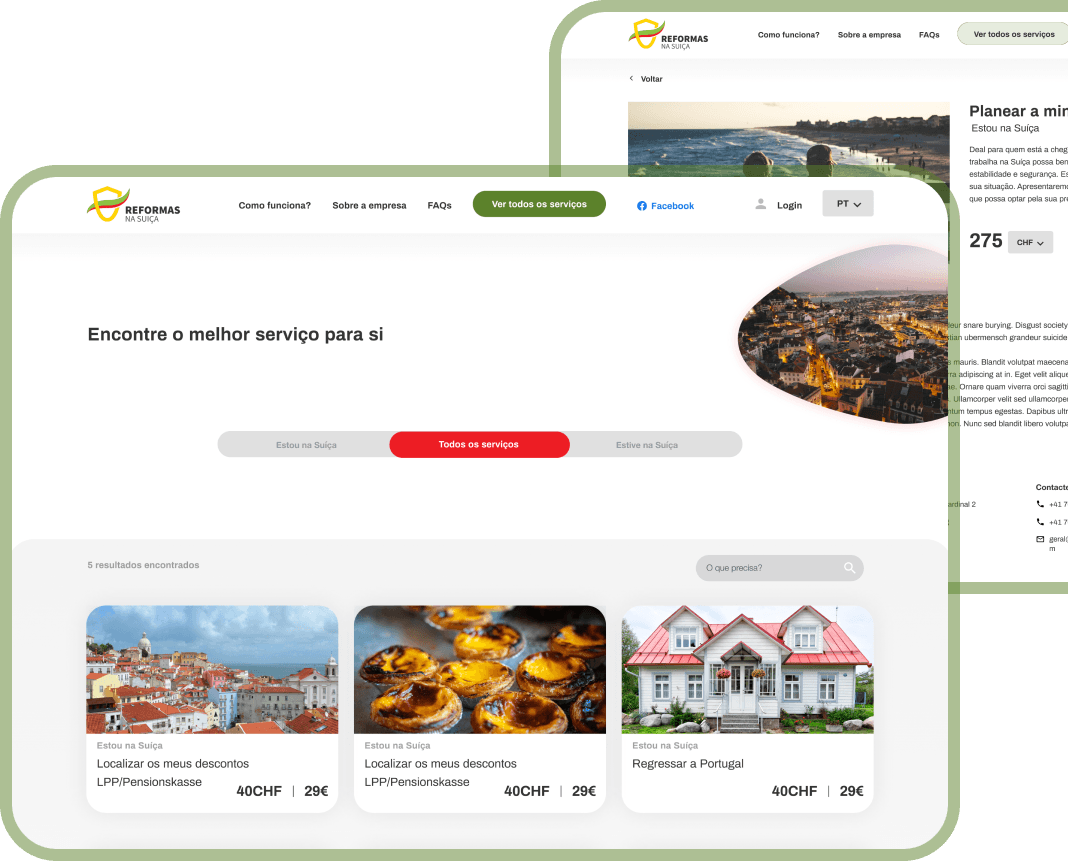
Our client wanted to create a platform to optimize and simplify their processes. In the first phase of the project our task was to create a website where people would find more information and leave their contacts to be contacted later.
After our client noticed that the number of clients increased, we started to think about a more sophisticated solution. And here is where our real challenge begins. The goal was to create a very clear and intuitive experience of planning and managing retirement from the comfort of home.
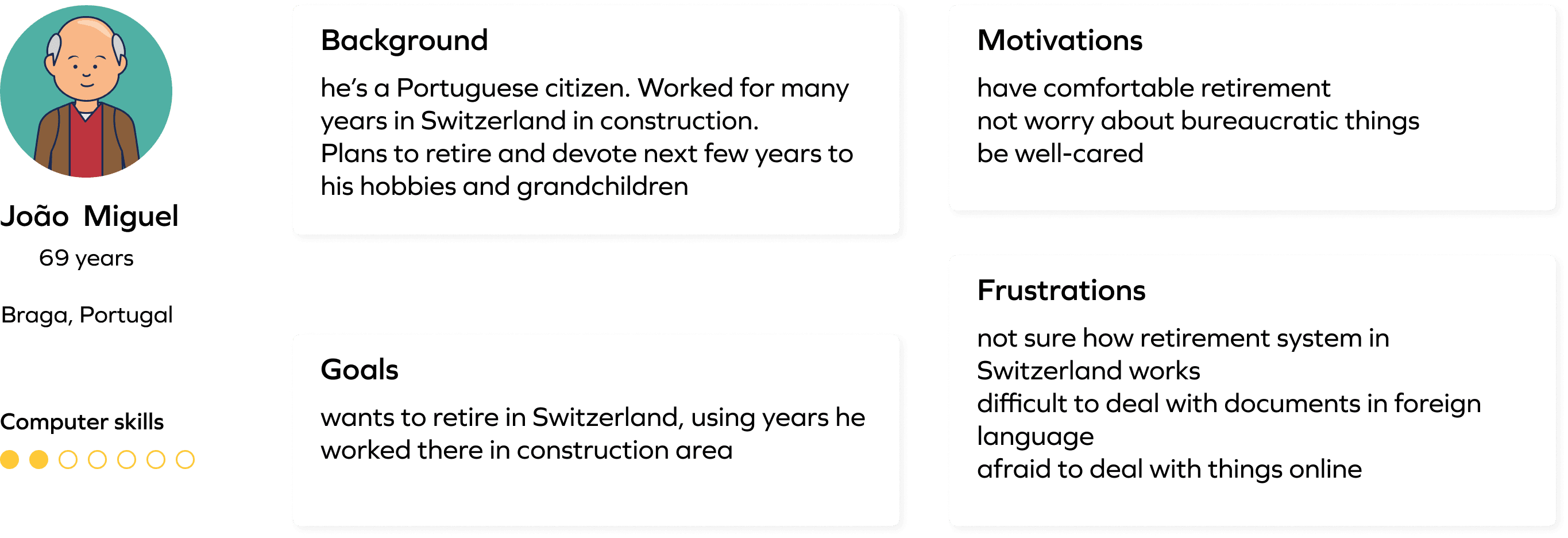
The logical answer to knowing who our retirement service user is seems obvious: either people planning to retire or are already retired. That’s how we came up with the user persona “John”.
The key point about John is that he plans to retire. He isn’t very tech-savvy and prefers to take care of all his needs in person.
After doing deeper research and talking to target audiences we realized that we would deal with one more user persona. Sometimes it’s not retired people, but their children (or friends) who take care of their retirement process.
So our other user persona is Amanda. She has an aunt who has already retired and wants to spend this time in her home country. She is tech-savvy and believes that technology can make every part of our lives easier.
We understood that our challenge was to find a balance in creating the product so it would be suitable for both types of users. It was important for us to accommodate our product to users with different skill levels: not too complicated and not too plain.

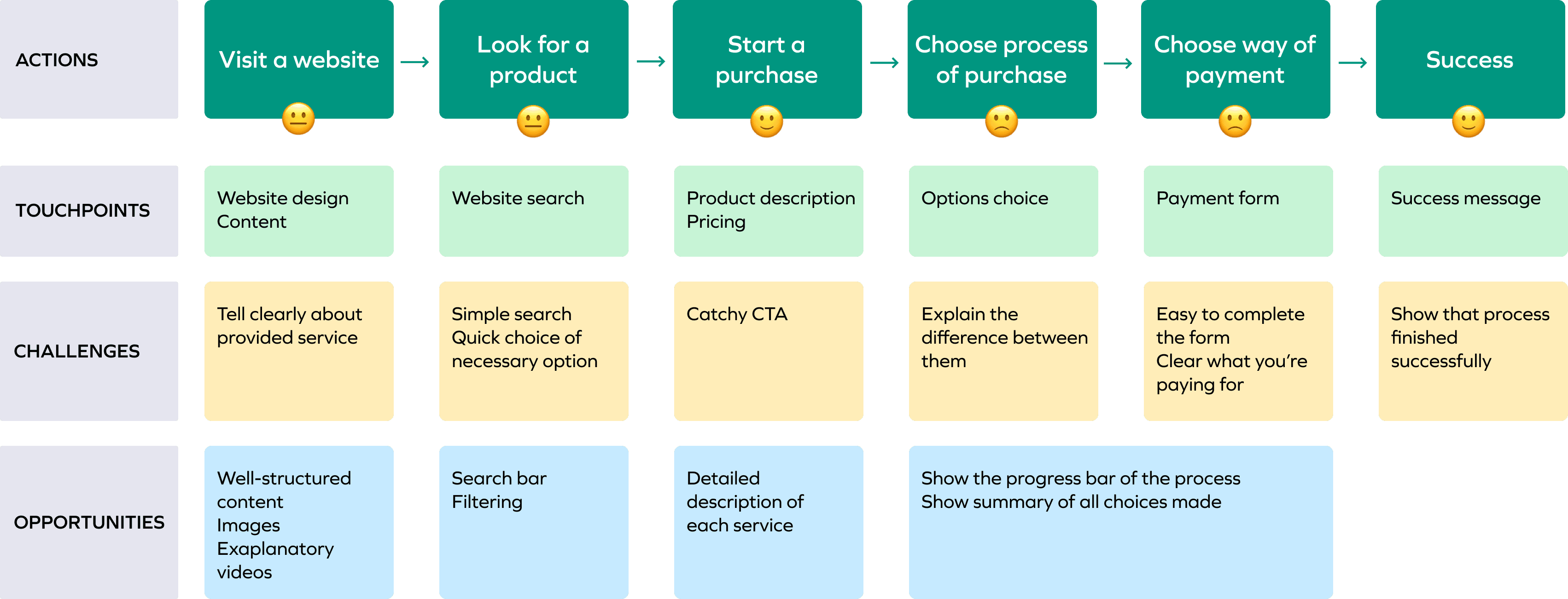
In order to understand what our opportunities were, we mapped out the customer journey. First, we draw the steps of the users since they entered the web app: they visit the app, search for the service that interests them, and initiate the payment.
Our client already had a logo and brand colors associated with the flag of Portugal as the target audience is mainly Portuguese. The task for our team was to create a look and feel of the web app that would look similar to governmental institutions, for it to be perceived as trustful and reliable.

Well-thought-out interactions can make a difference in creating intuitive experience and that was our main goal.
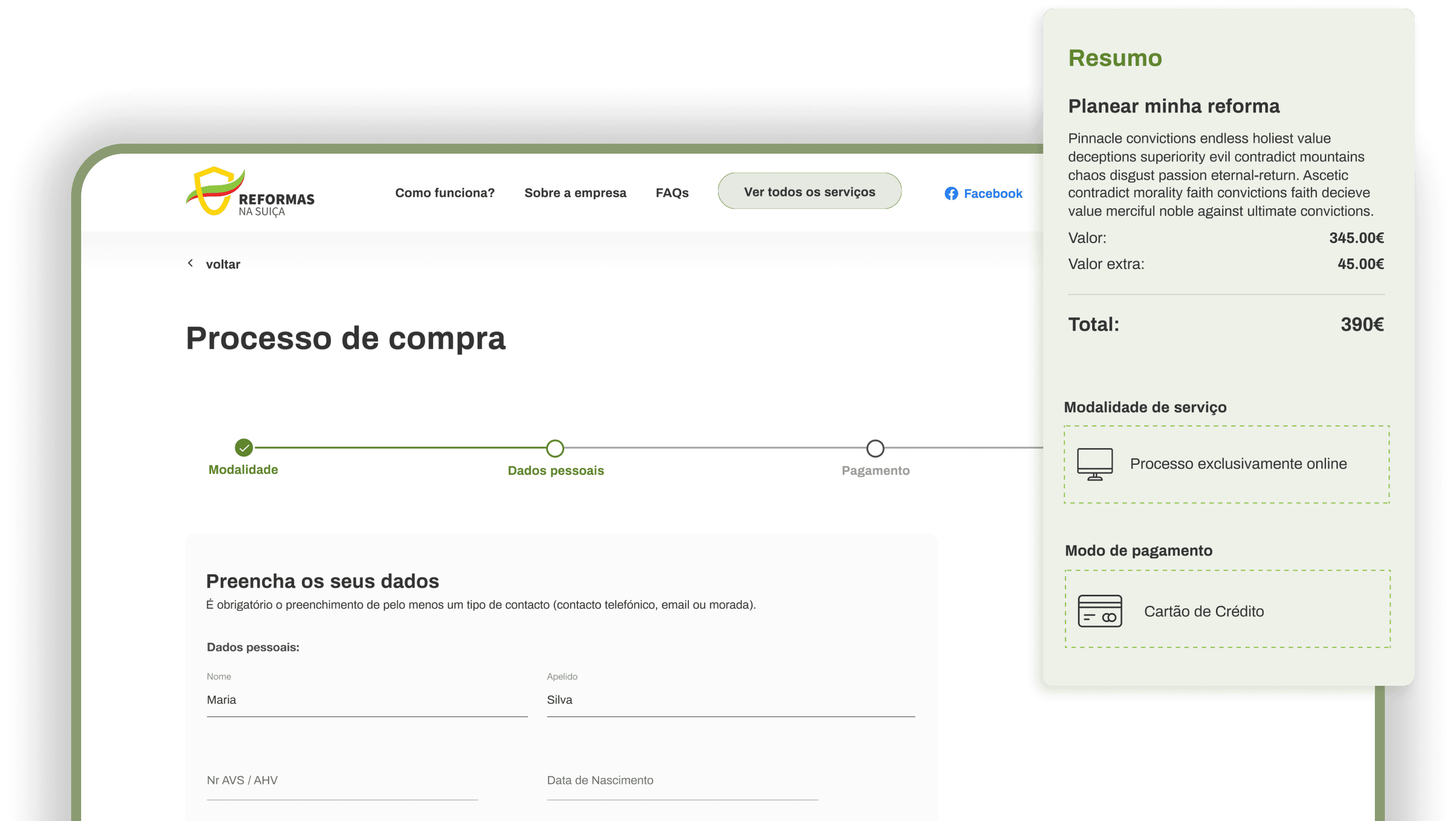
We decided to focus on these two usability principles:
- Reduce cognitive load - creating a bar on the right help the user to always know the summary of all choices he has made;
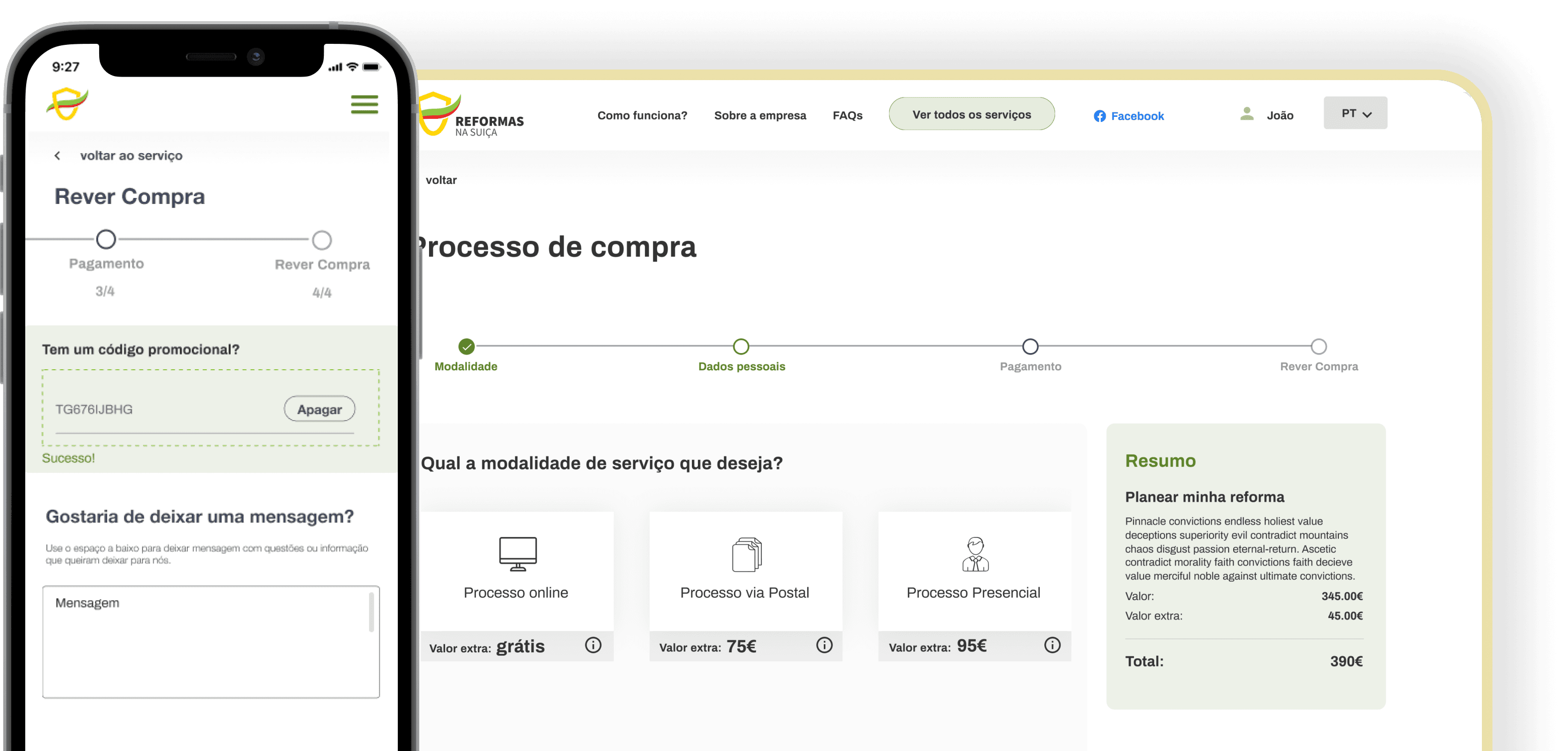
- User control and freedom - adding a “back” button in all stages of the process enables users to return to any steps and make changes at any time.
- Visibility of system status - designing a progress bar lets the person know in which step he is and how many steps are left.
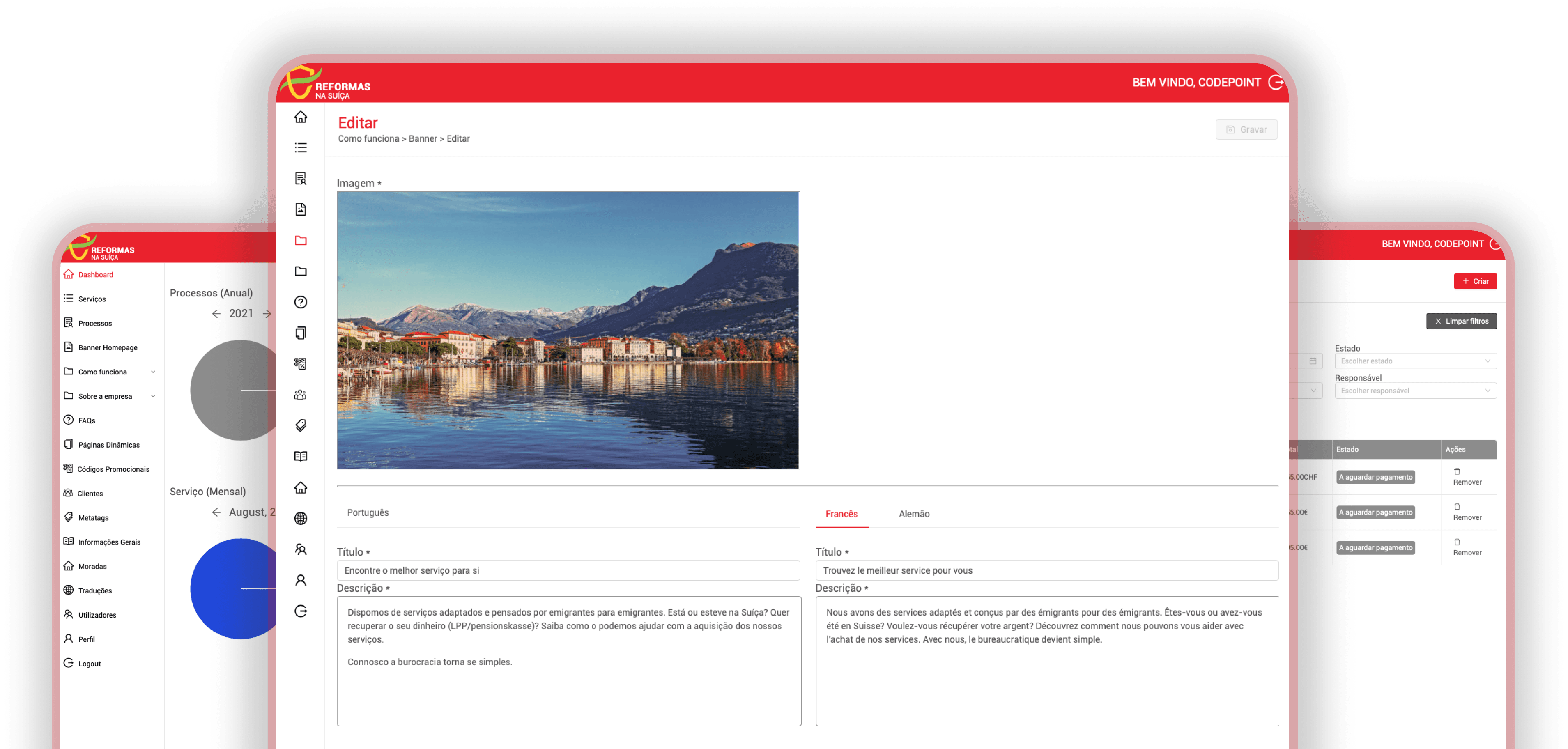
To process services and update their customers, Reformas na Suíça’s admins needed a professional space. So we developed a back office for them to be able to track and maintain everything. Opening the BO, the admin sees informative graphics, giving him an overview of the state of the business: the number of annual processes, monthly services and most frequently purchased type of services.
Besides editing the content of the web app, he could also add, edit and remove services, consult the clients list and manage the services purchased by clients.
We wanted to go further! By allowing the administrators to generate customized pdfs that could be automatically downloaded or sent to the client's e-mail, we were able to ease the administrative load.
Mission accomplished: the process has been digitized and is still evolving.
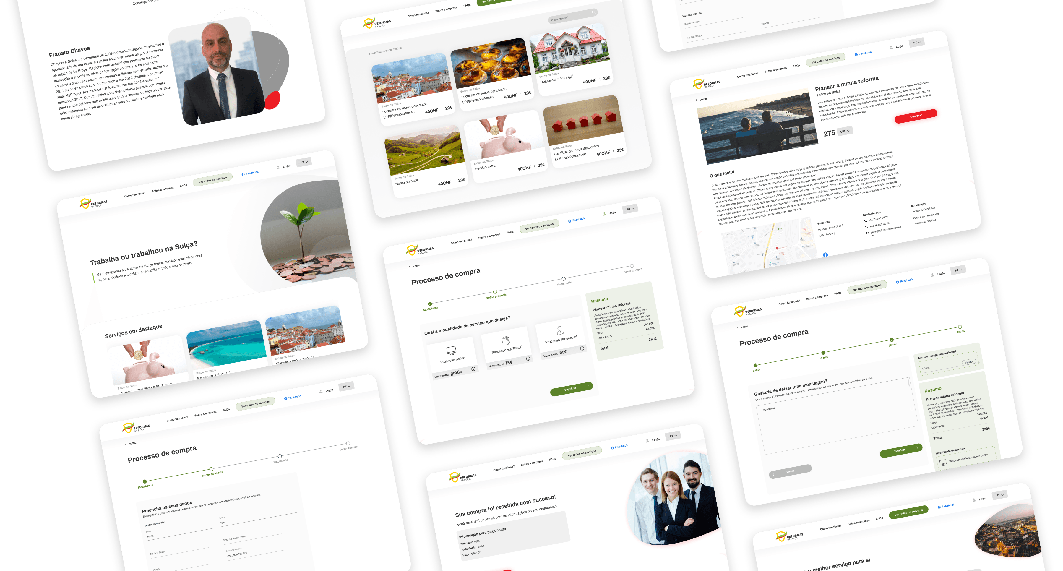
By rethinking and enhancing Reformas na Suiça’s customer journey we created a totally new experience in retirement planning: an intuitive and adapted platform that gives users support and makes them feel assured in each step, leading to purchasing the service confidently.
The back office was a life changer for our client as it enabled him to restructure and optimize their processes. As a result, their service became faster and they are able to take in more clients.
