2023 UX/UI Design Trends
Get to know our predictions of UX / UI design trends for this year.
At the beginning of every year, our team makes a habit of analyzing the latest trends in UX/UI Design. The goal with this is to:
- Keep abreast of what users have been showing interest in;
- (Possibly) Learn new approaches;
- Align our projects with those approaches (whenever possible).
This year was no different, except this time we thought we’d share the results of our research with you. We started by browsing through the websites of the top brands in the world, like Apple, Microsoft, Toyota, Tesla, McDonald’s, and Louis Vuitton. Then we watched youtube videos and read articles on Medium about the subject.
We saw the more frequent topics and chose those that made sense for us to mention.
Ready? Here you go.
We wish we could do that (or can we..?). But since we’re not there (yet) - what we can do is to deduct some things based on present findings. We strongly believe that many of these things will have their time soon. It’s good to be prepared!
Visual Design Trends
- Scrollytelling
- New Minimalism
- Dark themes
Giving an immersive experience is what everyone is going for. The trick here is not to load the readers with information or irrelevant images. Only the crucial one. The use of large font sizes is king: from H1 up to H3. Typography helps to support the effect of digital content, but is it enough though?
How to scrollytelling? Let’s start by defining it. This term is a combination of two different words: scrolling + storytelling. Basically is when you’re presenting a story - or something visual - on a scroll.
This format is used on long-format content and it makes the clients feel a part of the visual story. It’s a way of showing content to users in a more strategic, narrative manner. You want to tickle your customers’ curiosity. You have to make them want to interact with your content. Here are our suggestions:
- Fun call-to-action elements
- Different placement of navigation
- Out-of-the-box animations
- Dynamic elements accompanying other static site fixtures
Scrolling improves decision-making based on cognitive reflection. This strategy makes the design layout work subconsciously and consciously in people.
Why scrollytelling:
People will spend more time on your app/website as it has something interesting to interact with
It presents an exciting way to absorve information
It stimulates more than one sense: touching - as you scroll & click; vision - through the movement and animations;
See this Susanne Fellner example.
This is the ultimate example of “less is more”. Minimalism is popular because it can make your designs more straightforward, easier to use, and more rewarding… And who wouldn’t want that?! Besides those benefits, it is also fast to load, easy to use, and maintain.
New Minimalism focuses on functional objects without unfunctional decor, unobstructed negative space, flat elements and patterns, easy navigation and limited color palettes.
If you want to get this style right, just follow its principles:
1. Guide Users With Formal Visual Elements
The formal components of a piece, like a font, color, layout, and imagery, should be more than just aesthetically pleasing. They should fulfill a function such as communicating the intended meaning or directing the eye to a CTA.
2. Find a Balance between Aesthetics and Practicality
Utilizing a large number of graphics, animations, or videos may work as your enemy. You don’t want the users to close your page just because it is taking too much time to load.
3. Leverage the Power of Negative Space
The space that exists between the various elements on a screen is referred to as “negative space,” and it serves to emphasize the content. It is undoubtedly one of the most powerful elements of minimalist design.
4. Reduce the Number of Options on the Page
People can feel overwhelmed with an excessive number of options and an excessive amount of information when received all at once. Make sure you take great care selecting the visual elements and components that appear on each page.The next example is done by Daria Kravets
A big percentage of people employ the dark theme when using their devices only since it increases the battery duration of the devices and it presses less on the eyes (by being less saturated).
Besides, experts suggest turning on the dark theme at night before sleep to improve the quality of dreaming and fall asleep faster (nobody likes to feel like they have a flashlight pointing at their face at night, right?).
Dark mode, or anti-light mode, is a graphic design trend that truly puts users first (in a physical and practical way). Many companies have already introduced the dark theme design. Others offer to select a dark theme design so the users get the most appealing interface.
What team are you on? Light mode or Dark mode? It depends? Let's see Den Klenkov example.
- AI-driven design
- Accessibility
- Incorporating AR into everyday life
These AI tools can become the new UX designer's besties. Those are focused on:
These can help you automate your tasks or do them more efficiently. Imagine an AI tool that can help you create the best wireframes or the best information architecture based on best practices on the internet. Or one that allows you to extract insights from big data sets that would help with user research a lot.
Usability is for everyone! The user experience should be all about accessibility. All customers must be able to navigate your site easily and have an overall positive experience, don’t you agree? The time to increase accessibility is now. Here are some ideas on how to do that:
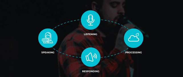
Voice search
This can be a great tool that helps visually impaired users navigate your site easily. Rather than typing into your site’s search bar, users can quickly speak it into the device and search it from there. This voice integration is one of the best ways to increase accessibility because it allows for a more hands-free user experience.
Mobile-first design
More and more people search from their cell phones nowadays. Building a website that prioritizes users viewing it from a mobile device like a phone or tablet is a smart move.
Technology has never been more touchable than right now! What can be more fun and attractive for users than playing with digital objects in the real world? Many companies are outdoing their competitors by creating products that offer these beyond-the-screen interface experiences. Will you get on board with this trend?
See this amazing work from Max Gedrovich.
Which trends do you think will happen? Which not? Feel free to leave your comments!
Thanks for reading!