Design Patterns in Creating Digital Products
No matter whether you work in a web development agency or in a product company, your main goal as a designer is to create products more quickly and efficiently.
Understanding and starting to apply design patterns is a go-to solution for you to explore. Once you understand which pattern solves which problem, you will start saving time and creating more intuitive mobile and web apps. Let’s explore this topic together.
To understand what a pattern is in product design, it is enough to make an analogy with real-world objects. Repetitive patterns in nature or in the decoration of rooms and clothing or patterns of human behavior (habits) have predictable elements. Similarly, in the design of the user interface, for about 99% of design problems there exist ready solutions and you don’t have to reinvent the wheel.
In the early stages of the creative path, designers often make mistakes and spend a lot of time looking for unique solutions, instead of looking for the right ones.
Is it now clear why it’s worth studying patterns? Let’s go through the theory basics of patterns.
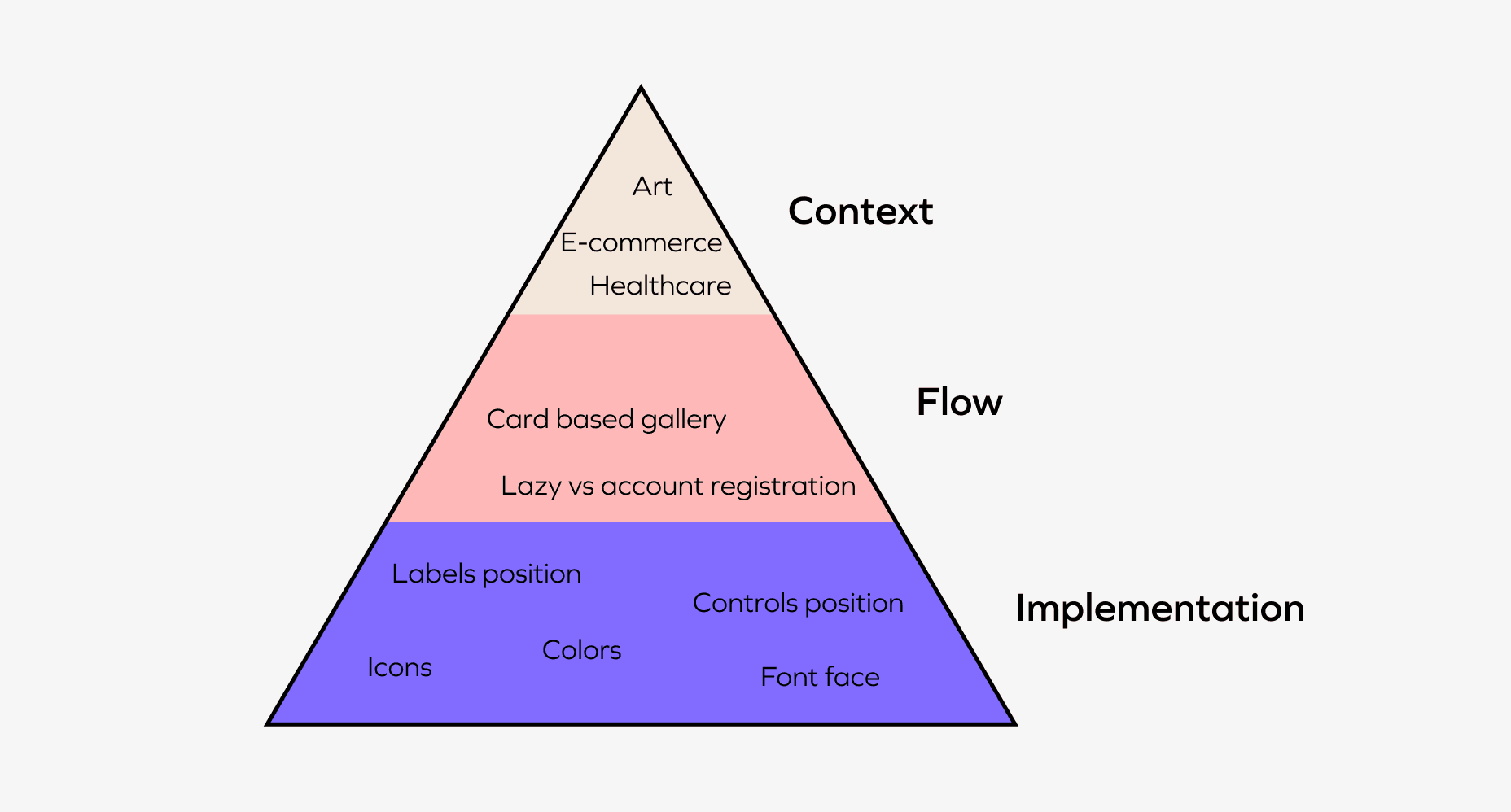
Patterns are divided into 3 levels:
- Context is based on the general topic of the product or feature. It can be a healthcare app, a call to action to make a purchase or a streaming platform. Research of the target audience gives an idea of the relevant patterns and styles;
- Flow considers typical user scenarios and the sequence of actions required to achieve the goals. For example, navigation, registration, or filling out the forms;
- At the lower level, implementation solves issues related to the placement of elements on the screen or the choice of color (e.g. red - dangerous, green - favorable).
Flow is a level that is the most important in the process of creating flawless user experience and in which designers make the majority of mistakes. Let’s dig into this deeper.
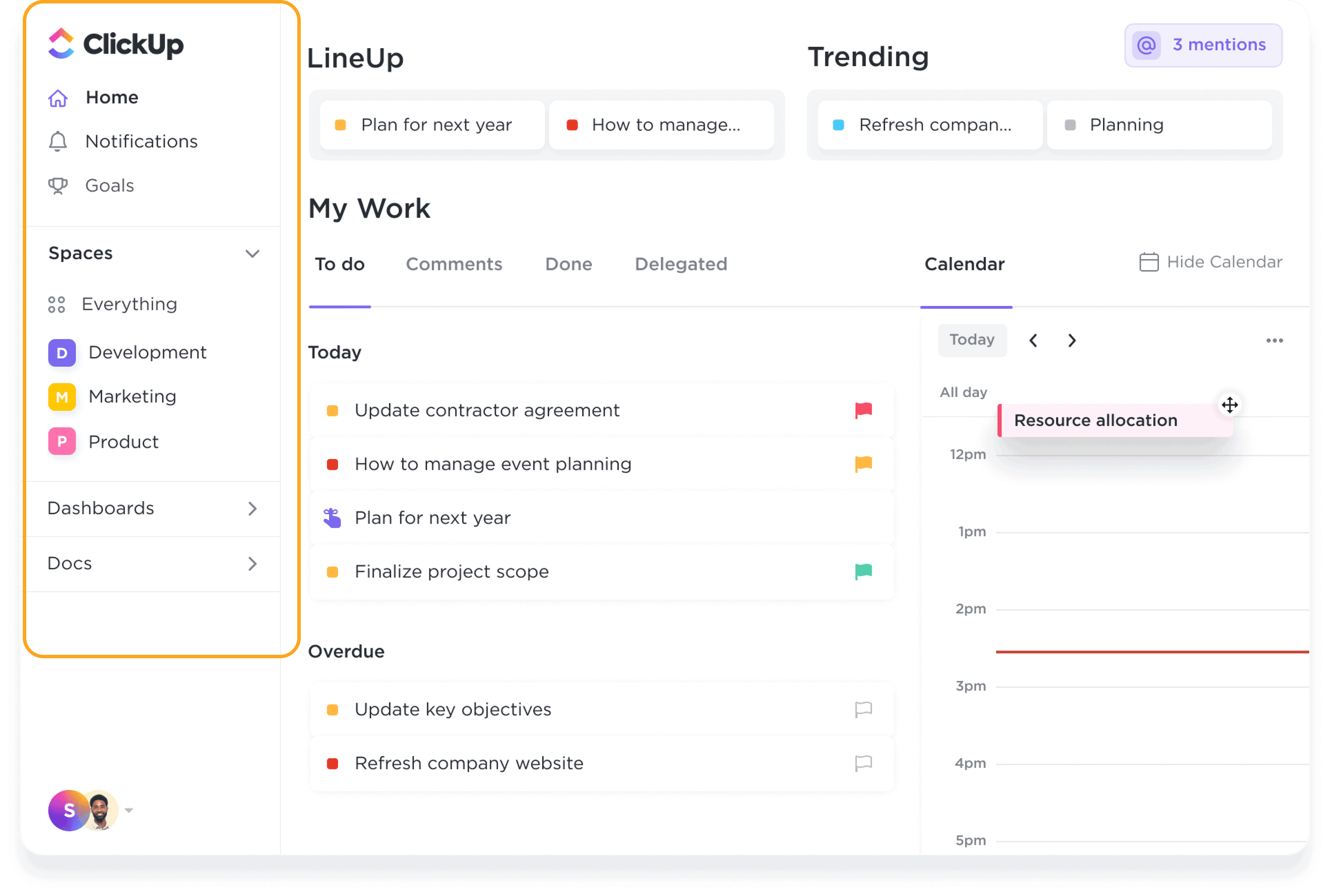
Navigation patterns
Allows the user to navigate through the product easily and quickly find what he needs.
Example: menu, tabs, breadcrumbs.
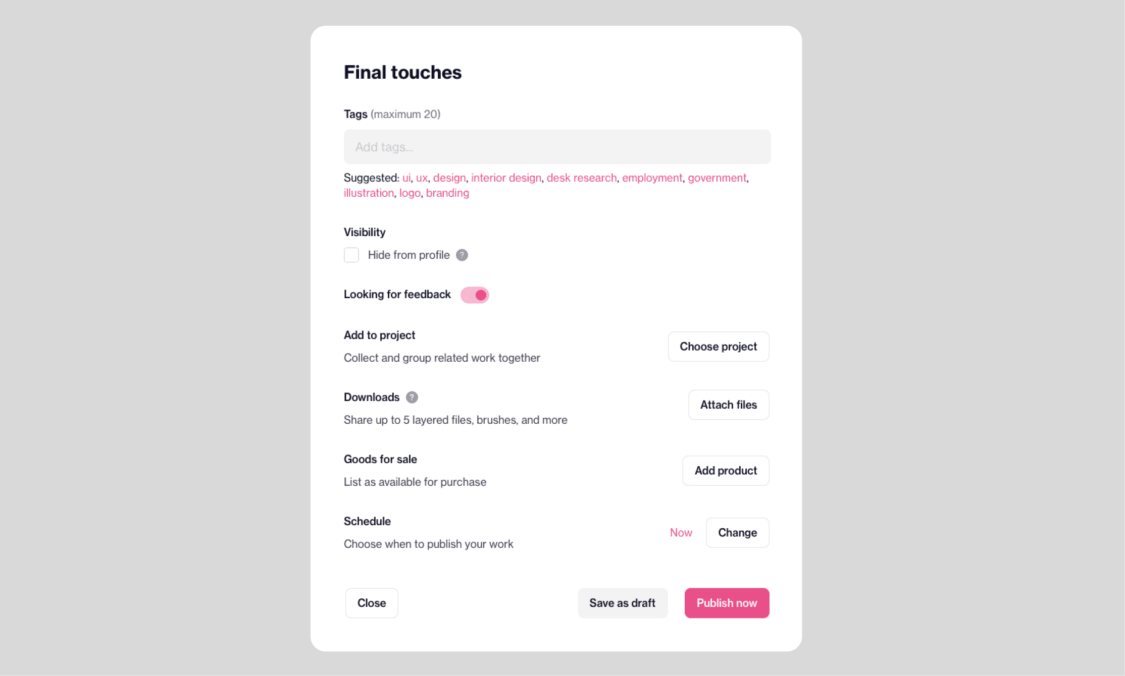
Getting inputs
These patterns allow the user to interact with the product by entering information and receiving feedback.
Example: text fields, checkboxes, drop-downs, upload fields, and more.
Dealing with data
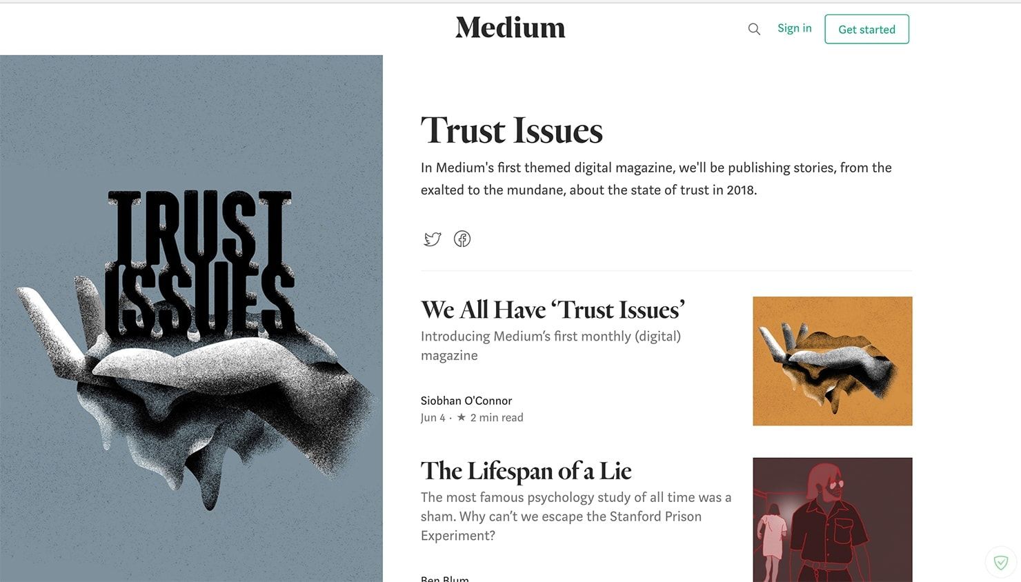
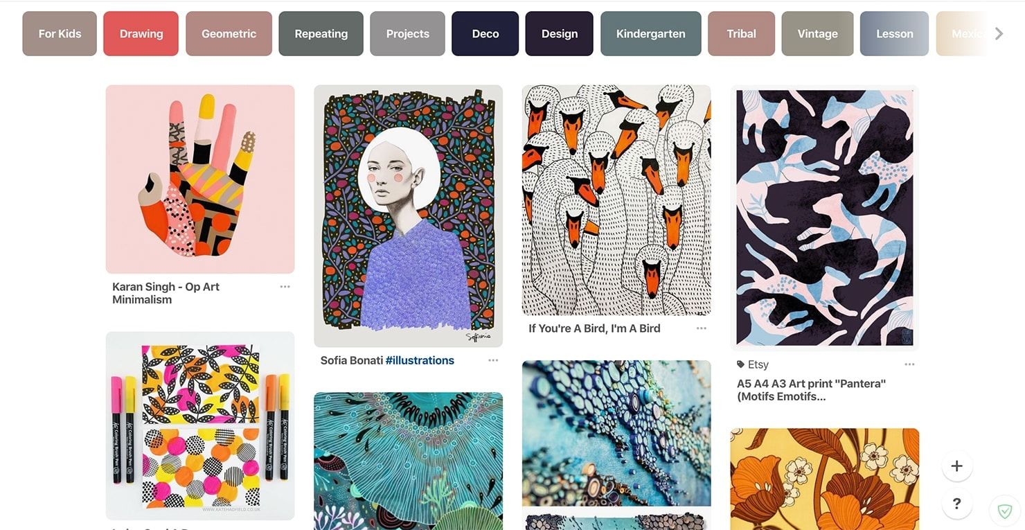
How content is displayed for quick viewing, searching and working with it.
Examples: galleries, tables, cards.
Social
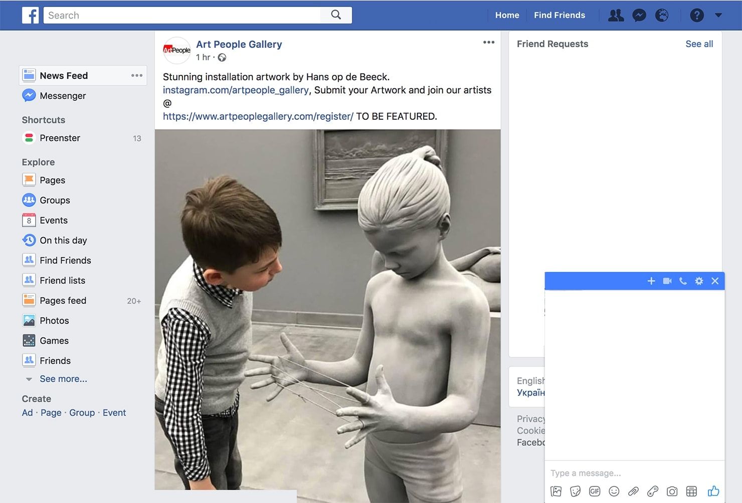
How a user will connect and communicate with others online.
Examples: chats, feed, boards, reviews.
- Meet users’ expectations. When a user notices a familiar pattern and it works according to the person’s expectations, the human brain produces dopamine which makes the user feel good. As a result, the user associates this positive feeling with your digital product and has a better user experience.
- Use proven solutions. You spend less time using off-the-shelf solutions instead of starting from scratch.
- Code standardization. You make fewer design mistakes using standard unified solutions since all the hidden problems in them have been found long ago.
- Simplifies team communication. Instead of spending an hour explaining to other designers/programmers what design idea you came up with and what resources are needed to implement it, you can just tell a pattern name.
Useful resources for exploring design patterns:
Do you remember the moment when you came home and turned on the lights? Most probably not. This action is already so automatic that after coming home your hand deliberately moves towards the switch.
Same with product design. It makes no sense to complicate the lives of users, if you can help them. We are all used to the cross in the right upper corner of the modal window. Why should we change it?
Do not distract the user from solving his problems, unless there is a specific goal for. But even in this situation you have to clearly justify the "what" and "why" of this decision.


